Elle is stepping into the skincare market in Dubai and wanted standout packaging for their debut.
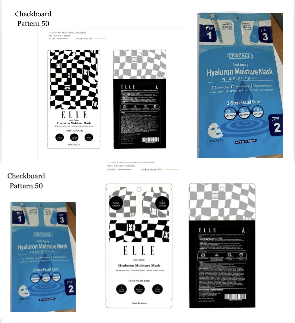
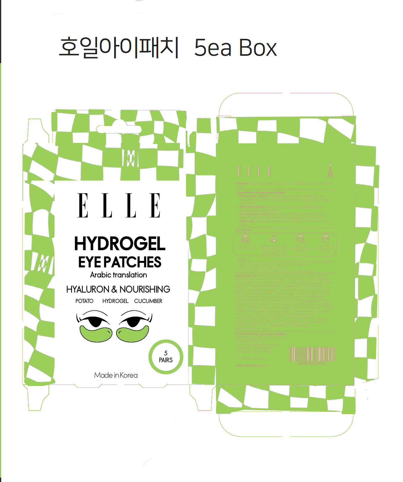
The brief required me to create coherent packaging across SKUs and further create packaging dyelines in communication with the manufactures.
In order to create a standout color palette that could be carried across 10 SKUs, I researched the skincare sections of Dubai beauty stores as well as drug store. The common color theme across skincare aisles was the either of very pale colors or followed similar earthy tonal values.
We knew we needed something POPPING!
FINAL CONCEPT IMPLEMENTED ON PACKAGING
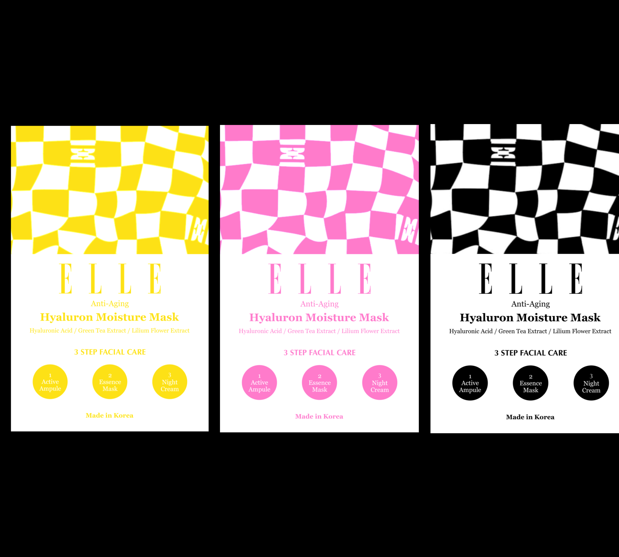
Shuffling between a pastel palette or bold colors, the Elle team and I found that bold colors would better represent the glee and cheer associated with Elle magazine. While, still providing a bold look on the shelves.
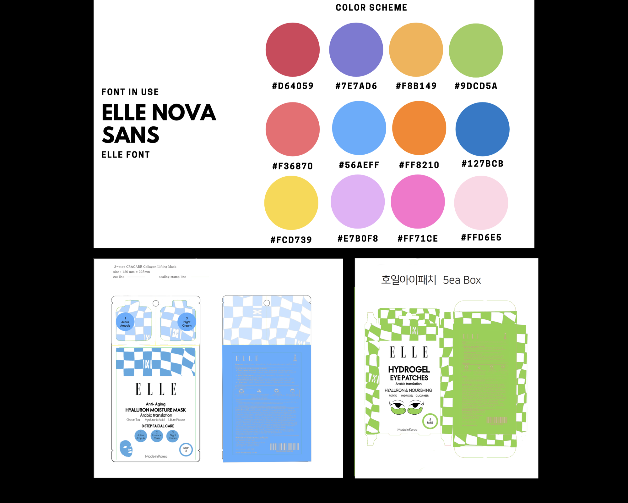
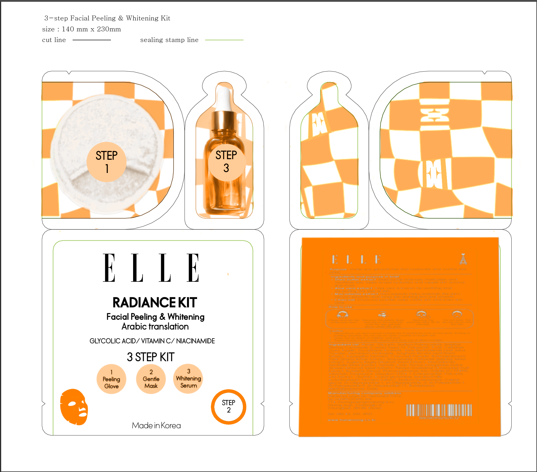
FINAL COLOR SCHEME AND CONCEPT
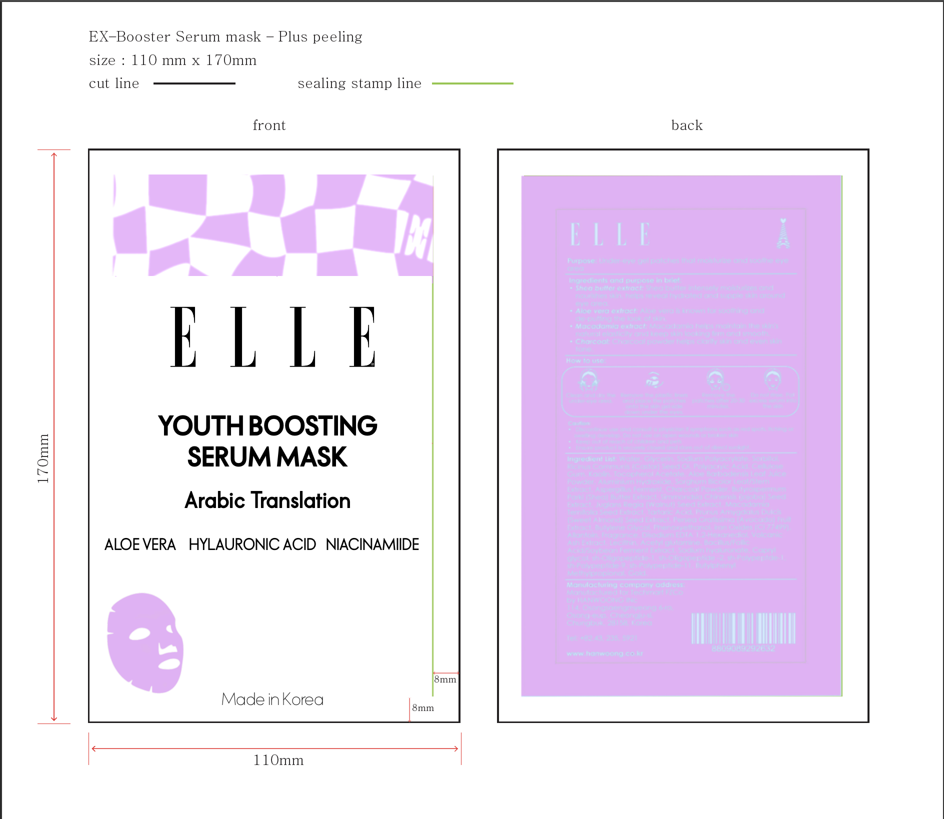

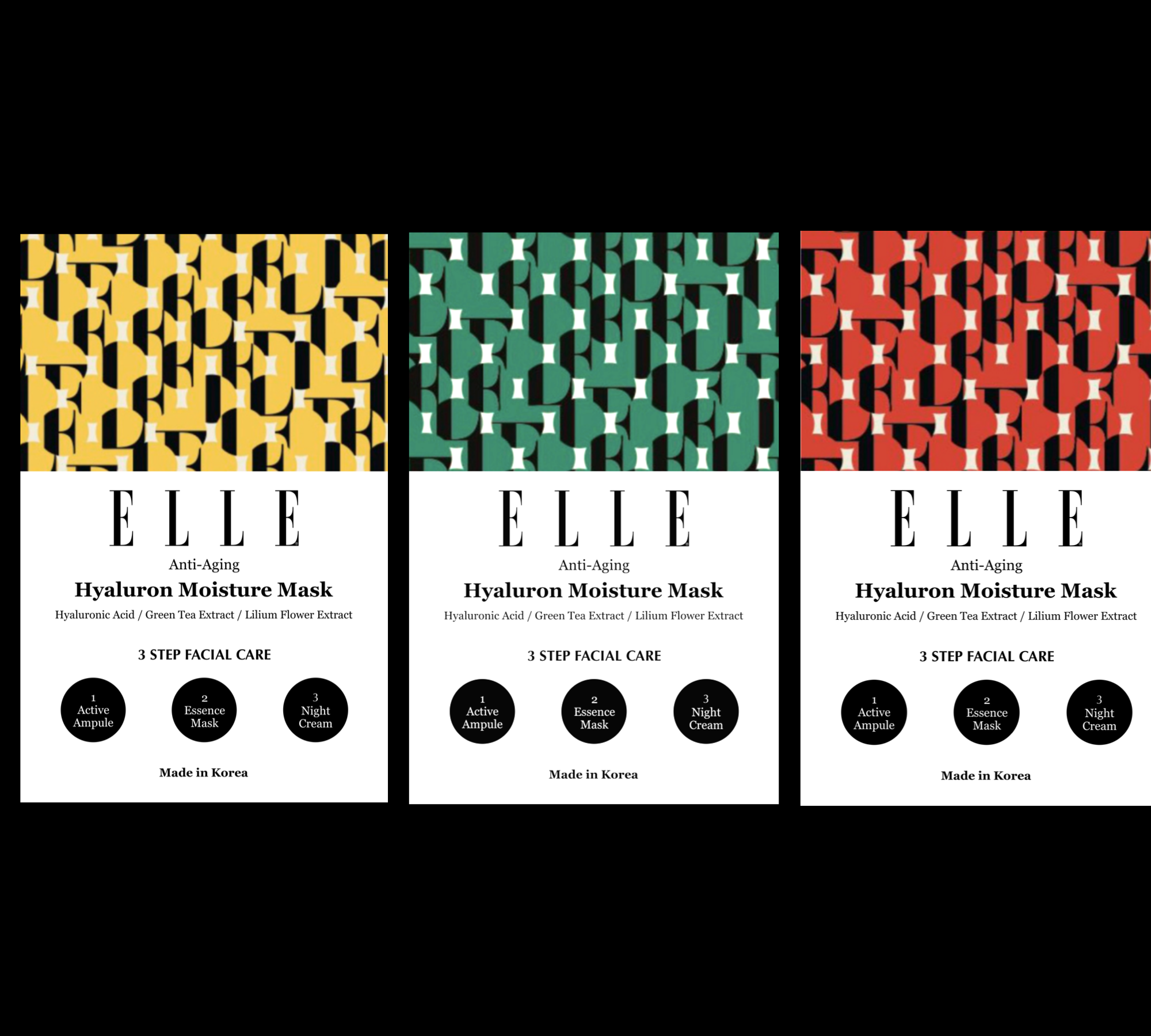
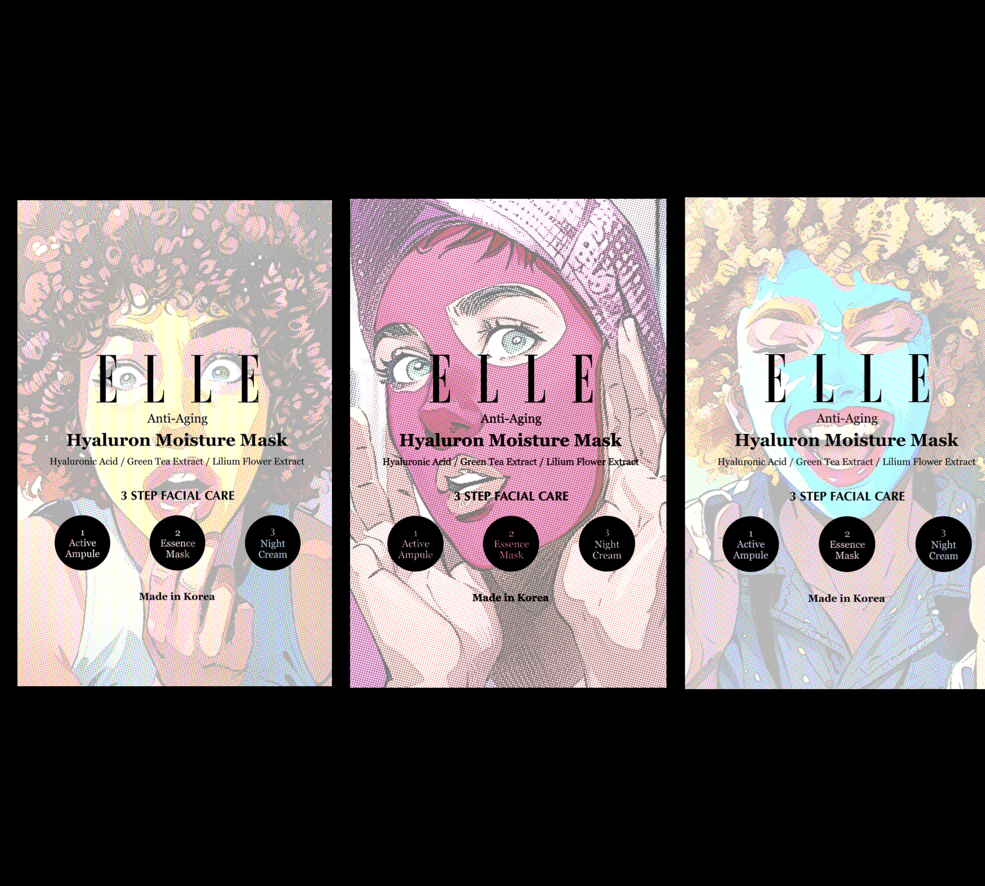
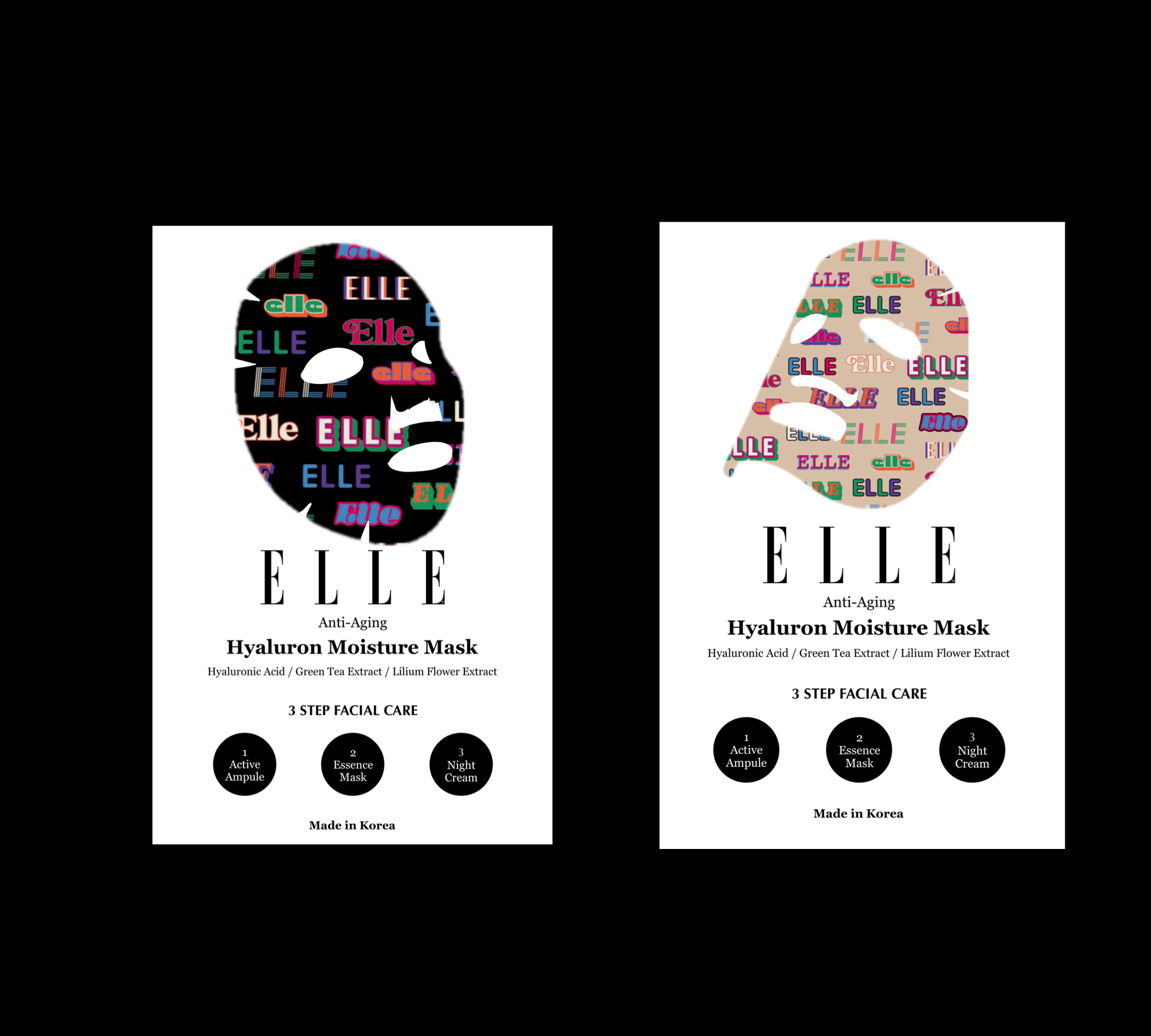
INITIAL CONCEPTS PRESENTED
Alongside the brief I was also given access to the ‘Elle Icon Library’, a collection of graphics used by Elle across their products and prints.
We decided on exploring the option from within the library.
This is the packaging concept the team and I fell in love with and decided to explore the color scheme further.
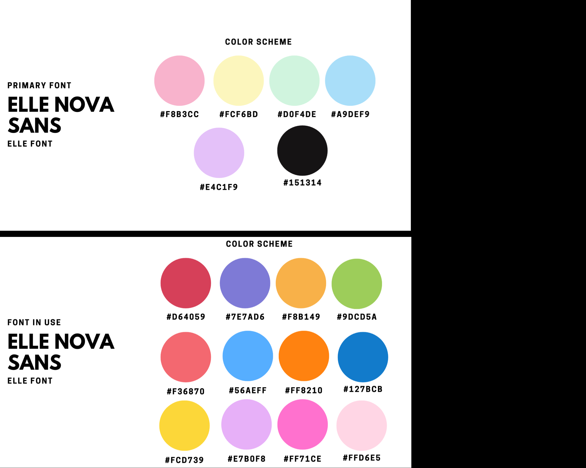
COLOR SCHEMES WE SHUFFLED TO AND FRO
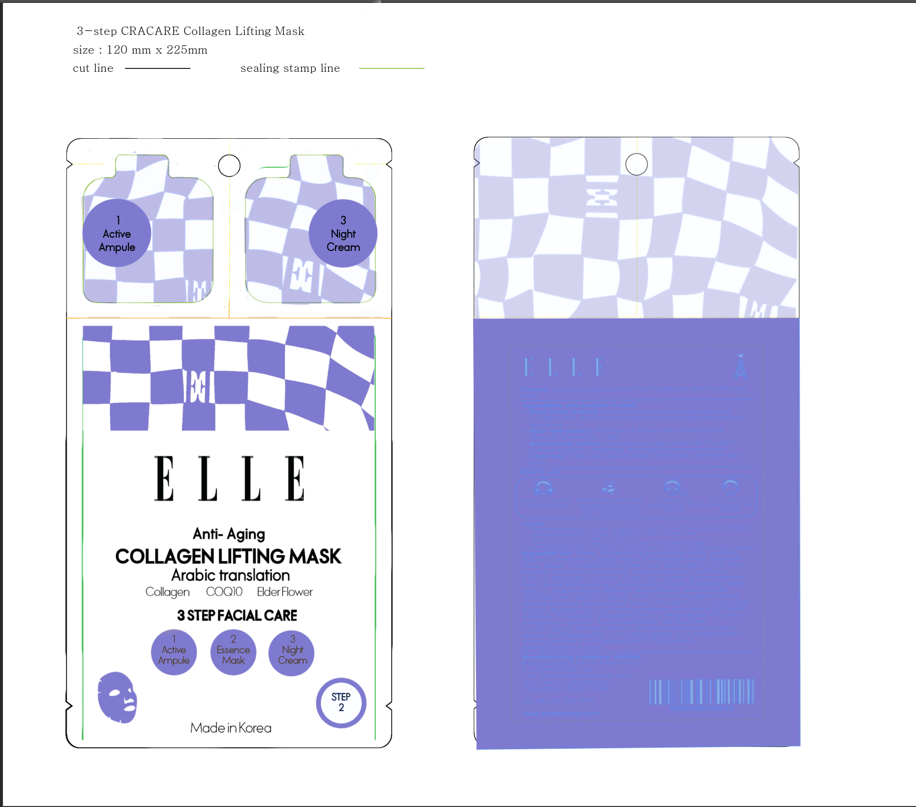
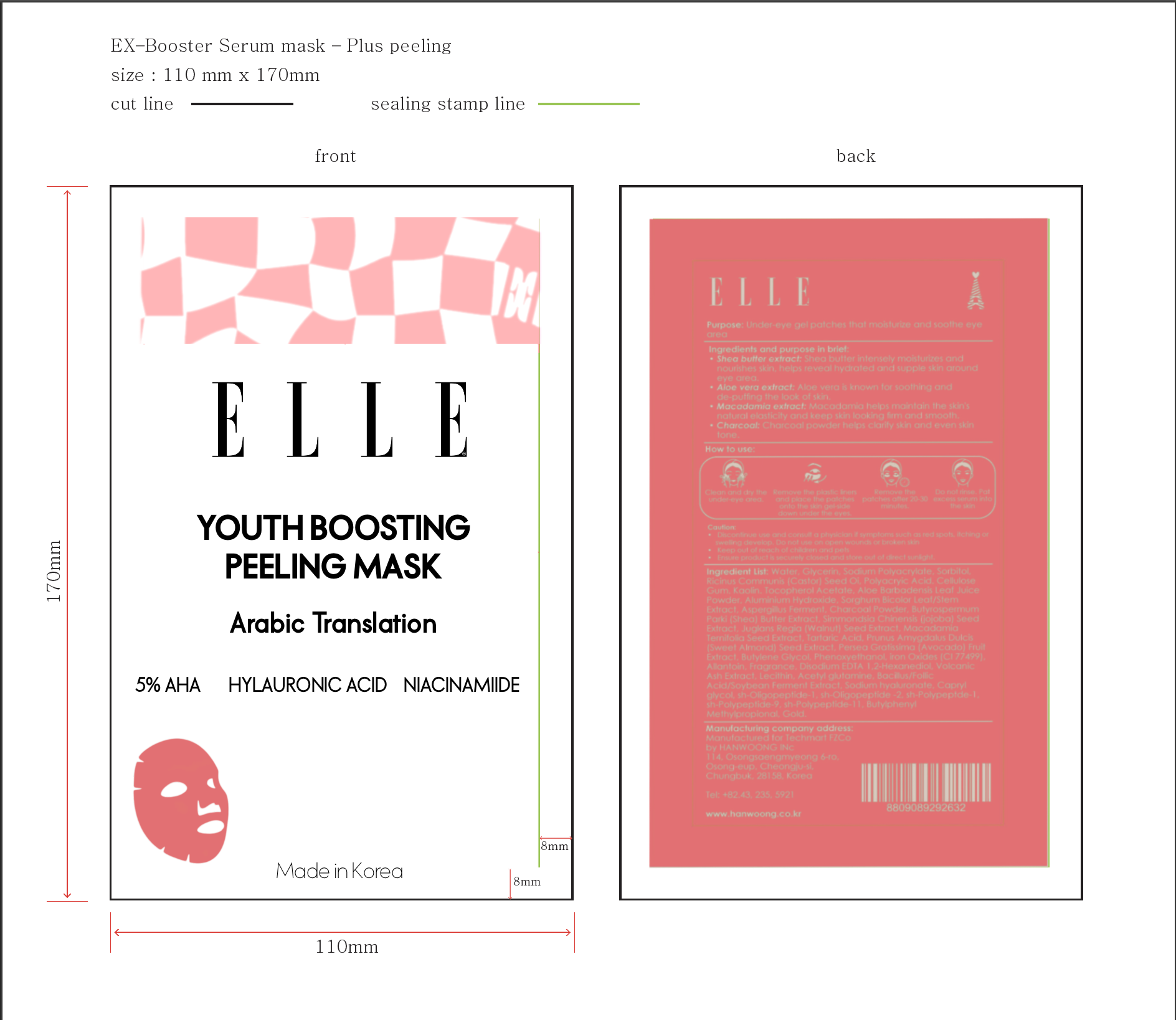
We finalized on the bold color scheme, sans serif font pairings as well as minimal illustrations to function as infographics within the packaging.
And with that I was done providing my services within concept design I put in filler text on the back as the final packaging needs to be in Arabic.
I provided my clients with editable InDesign files.
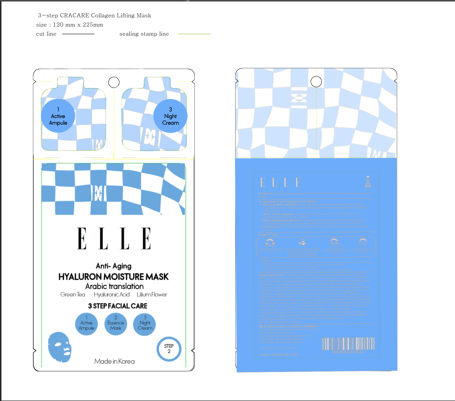
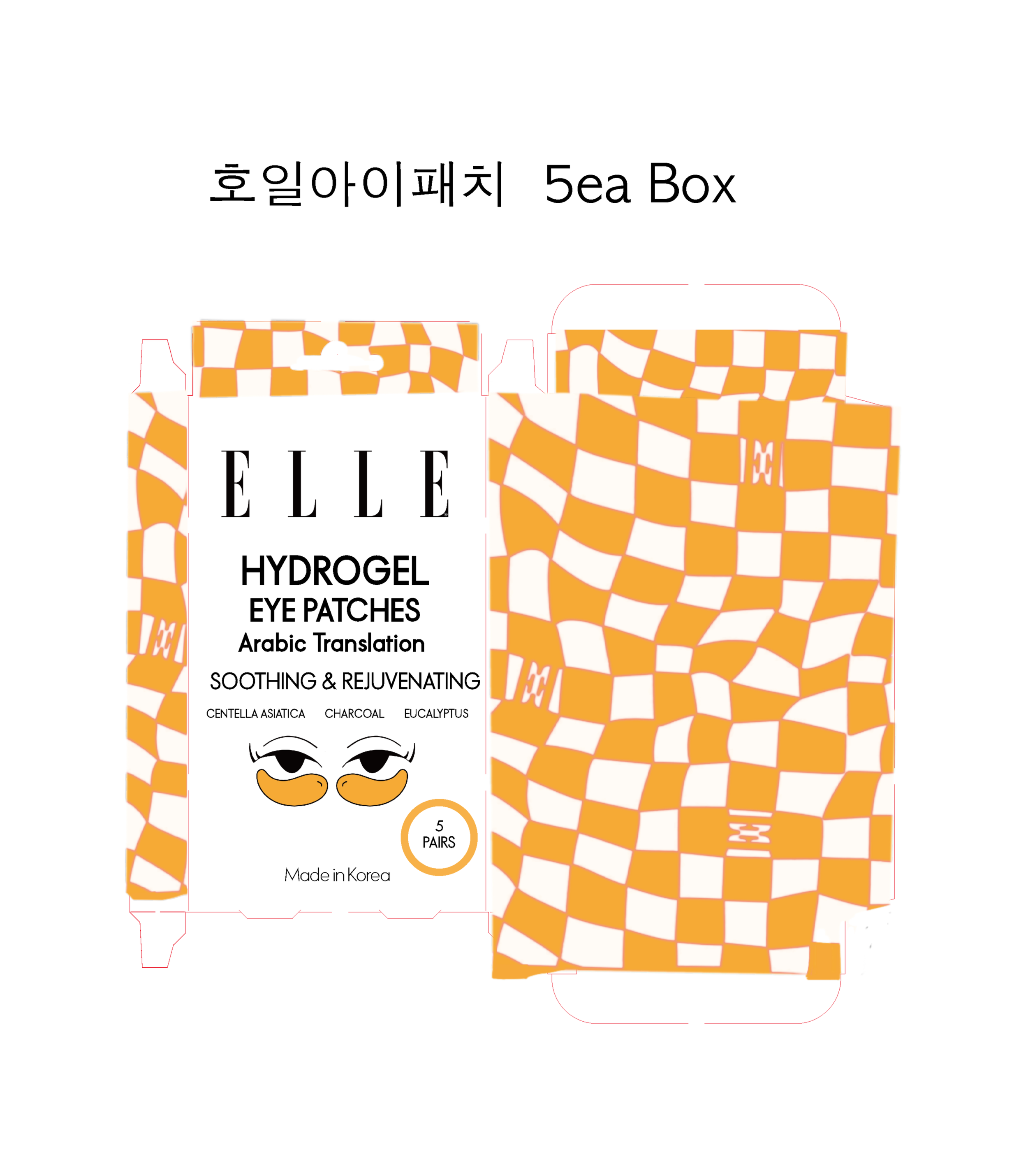
FINAL PACKAGING DESIGN ON PRINT READY DIE-LINES
FINAL PACKAGING LAUNCHED IN THE MARKET
